Saturday, March 30, 2013

chalk it up.

The other weekend I woke up craving a new project.  I asked Ehren if he wanted to go to ReStore and look for a new project to do.  We've been there before and haven't had much luck finding anything.  You have to keep an open mind and look for potential.  Like when we saw this ugly thing:


I figured it could go by the front door as a new console table.  I thought we could paint it and put some baskets on it for storage.  We had some inherited furniture by the front door before, but not exactly what we wanted.  I also put the chevron canvas there because we were not using it above the fireplace.  The two drawer chest was too low but it worked for the time being. 


We scored it for $30 after they took a discount off of it for the manager's birthday.


After cleaning it, I was ready to prime it. 


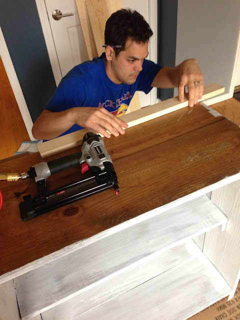
In order to have more space for accessories, we decided to make a larger top out of 1"x 8"s and a 1" x 4".


Oh, nail gun, how we love you so (except for Cozy).

Side story:  The first time Cozy was around a nail gun and air compressor was when we refinished our laundry room.  When it suddenly kicked on and made a loud noise, it literally scared the shit out of him.  Cozy ran upstairs and crapped all over the kitchen.  Now, he just cowers and pants.  


I painted it with Martha Stewart's paint from Home Depot in thundercloud that I've used on our end tables.


 I ended up doing a coat of primer and two coats of Benjamin Moore paint.


And much like "If You Give a Mouse a Cookie", if you give Jamie a console table, she's going to want to make a chalkboard to go over it.  We got a piece of plywood from Home Depot to make a chalkboard.


After priming it, we used some Crack Shot to fill some of the dents and ridges to make it as smooth as possible.

We checked the size and spacing.


Then made a frame out of some cedar - it has a rough texture that will contrast well with the smoothness of the chalkboard and console top.


I ended up doing one coat of primer and two coats of chalkboard paint.


Then we nailed the frame around.  I'm glad I ended up painting the frame white because it will camouflage the white chalk that will pile up on it when I draw on it. 


We went to Springfield last weekend to visit some friends and we went to an antique mall.  I found these lovely teal canisters that I knew would fit perfectly on the new-to-me console.


Time to stage and accessorize!


I found these storage bins at TJ Maxx and loved that they had chalkboard fronts that would go well with my new chalkboard.  I figure we can put mail and Cozy's leash and collar in them.


And since tomorrow is Easter, I figured it would be appropriate for this to be my first "artwork".  Plus, it's a good reminder of what is important after a heartbreaking loss for the Jayhawks last night.


I'm so excited to have this done.  I've always wanted a place that I can decorate depending on the season, holiday, or mood I'm in.  With this blank chalkboard canvas, I can add any color, pictures, or decorations without having to drastically change anything.  At Christmas, I could add some DIY decorative Christmas trees, at Halloween some fun pumpkins, etc.  The hardest part about this project will be erasing my artwork.  Maybe it'll be Easter in the Feldmeyer house for a while.


Wednesday, March 20, 2013

walls and floors and doors, oh my!

Made with Shapely App
Now that everything has been torn down and removed, it is time to build it back up and re-do everything.  We tore out the old dry wall for multiple reasons.  First, it had been wallpapered, de-wallpapered, bordered, de-bordered, painted, spackled, and sanded.  Every texture you could think of but not want.  Also, we knew we wanted to put in a pocket door to make more room in our tiny master bath.  You obviously have to remove at least one side of the wall to put in a pocket door, so we thought, might as well rip out all the walls!  We figured it would be quicker than trying to smooth out the other two walls.  Plus, we thought, "we've never drywalled - might as well learn now!" (Just like we did with tilinginsulating our atticstaining our deck, etc)

Here's where we left off in the last blog post:


The guys at The Tile Shop said that when you tile a floor, it should be 1 1/2" thick.  This includes 1/2" of subfloor, 1/4" of cement board, 1/4" of thin set, and 1/2" of tile.  This makes a sturdy floor and will prevent the tile from sagging and therefore cracking under pressure.  We just went with the cement board Home Depot carries.


After the cement board was installed, we were ready to start tiling.  Since we are now unprofessionals, we weren't nearly as scared as when we did the shower.


Tiling the floor went a lot faster than the shower - obviously since the tiles were larger (6" x 24") and less area to tile (30 square feet instead of 85 square feet).  We got it done in one day, and by one day I mean Ehren finished tiling at about 6:30 a.m. when I woke up for work.

But look at the beautiful, charcoal, striated, hardwood floor looking tile!  Totally worth it.


We thought grouting the floor would be easier than grouting the walls but we were wrong.  It reminded us of staining our deck: we bruised every bony prominence that touched the floor as we backed our way out of the bathroom.  And since the floor is so dark, you could see the grout on the tile very well.  We kept asking, "isn't it clean yet?!".  It took a while and we ended up with some bruises but there is nothing like the difference grout makes on a freshly tiled surface!


Once we got the floors done, we started on the walls... or lack thereof.  


We ripped out the door frame to prepare for the pocket door.


We got a pocket door kit from Johnson Hardware through Home Depot.  It was delivered quickly and had the best reviews online.  No one on the Home Depot website recommended the brand they carry in the store, they recommended this brand.  We decided to impatiently wait to have a kit delivered since we didn't want to have to tear out the wall again if the other brand failed.


Bless Ehren's heart for taking the time to read through the instructions and follow them so well.


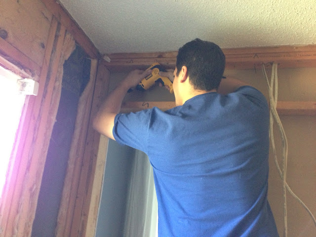
You obviously can't have electrical outlets where the pocket door will slide, so we had to move the electrical to the corner.  Luckily we had enough slack that we could re-route the outlets without difficulty.  Well maybe a little difficulty.


The only way to do it was to stack them.


You can see the new frame that we built; the pocket door slides through the metal-wrapped studs.


This is looking through the wall, where the door will be.

We also built out studs for the new light - in order to center the new light, we had to add some 2"x4"s.  (The new vanity is wider than the old one).


Luckily, the door slides and works like a charm!  We were so excited we chose to do a pocket door and  that it worked.  Before, the door was always open, it covered the window, and it stuck out from the wall and took up a lot of space.  Now we forget we even have a door!


Now for some real walls.  We got Green Board which is a mold resistant drywall recommended for bathroom walls.


Next, we mudded.  We ended up doing 3 coats with 24 hour drying time in between.  We set a space heater in the bathroom with the door closed to speed up the process, especially since we keep the house at a balmy 62 degrees during the winter.  


Sanding is fun.  Not.  Oh, and if you're looking for a new hairstyle like the one I'm rockin' here, stay tuned for the next blog post!  


Then we primed the drywall with Kilz drywall primer.  Catchy name, huh?


Finally, the part I was looking forward to!  Getting some color on the walls.  Okay, maybe not a whole lot of color, but color indeed.  We chose Stonington Grey by Benjamin Moore.  We used the Aura line of paint because it's recommended for bathrooms and it comes in a flat finish.  I was dreading using a glossy-ish paint for a humid bathroom, but Benjamin Moore came through and saved the day.  I don't use painter's tape, all you need is a Purdy brush and a smooth stroke.


I also got to pick out a new register for the vent.  I didn't want it to stand out too much so I went with the matte black one.  I think it's just right. 


That was a lot of pictures, especially for such a small room but it's fun to see what a difference walls and floors make.  It's starting to feel like a real room instead of a DIO mess.  

Cozy asks:

"Mom, why are you standing in the shower?" and

"Do you guys like the bathroom?"


the black plague, part III: front door

Now the black plague has moved to the front door.  While I think the "rustic" and "distressed" look has its place, I do...

Blog design by Get Polished | Copyright 2016